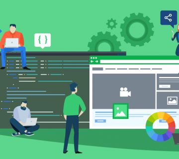
Having great content on your website is just half the battle. These days, when there are over 600 million vastly different websites out there, visitors’ attention spans are even shorter than ever. People want to be instantly wowed in their first impression of a site, in addition to wanting to receive quality information. To deliver both, and keep your visitors interested, there are five things you need to remember when designing your site:
1. Novelty
Having something different on your web page, whether it be a picture, design or unconventional way to display information, is going to keep visitors interested. After all, having a generic website with generic information is not going to do you any favors. Chances are, people can (and will )find that information from some other website. Pages with designs that demonstrate creativity and originality command immediate attention, and can help websites gain and sustain visitors.
2. Contrasts
No matter what the theme of your website–be it fitness, finance, sports, or homemaking–showing people the difference between two items is a great way to get their attention. Neutral statements do not grab attention in the way that before/after, risky/safe and fast/slow comparisons will. The human brain is wired to react strongly to contrasts, snapping to attention the second someone says “X is greater than Y”, as opposed to, “X is good.”

3. Emotional Connections
If someone visits your website and does not feel any emotions, chances are they will click the back button and look elsewhere. You don’t necessarily have to evoke positive emotion, but you want to leave some sort of emotional impression on the visitor. Whatever emotion that most stimulates the purchase or use of your website’s products or services is the emotion you should be aiming to evoke from your visitors.
4. Patterns
Displaying information in a jumbled or boring way will put your visitors off faster than you can say “box plot”. If they are confused by what you are trying to say or how you’re trying to say it, chances are that they are less likely to retain the information you present.
Try this formula:
- Start with an appealing statement meant to catch the visitor’s attention.
- Summarize the information they need
- Finish with a call to action (these often appear in the form of a “Buy Now” button)
5. Infographics
Infographics are an excellent way to get a lot of information to a visitor in a quick graphic/image. Infographics are great for displaying flowcharts, highlighting the results of a study/poll, or summarizing a large amount of information. With an infographic, information takes on new life, as colorful charts and easy-to-read text boxes, instead of standard graphs and tables. Infographics draw the eye, in the same way pictures do, but instead of distracting from your text, the graphics incorporate the text in a way that holds the visitors’ interest.
There are many different ways to create the perfect website, but most successful sites will take these five elements of site design into consideration when they design their pages. When these elements are used correctly, your website will have the necessary foundation for success, bringing visitors in and giving them emotional, educational, and logical reasons to stay.
Informational credit to Infographic World


