One of the biggest changes in Windows 8 is that the Start menu has been replaced by a Start screen and, with it, the way to start applications is very different. While the Start screen is very good when it comes to instant searching for or launching an application for some people it proved to be rather unfriendly. There are, however, plenty of advantages of the new interface, some of which will be discussed below.
Different Shortcuts
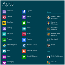
After counting shortcuts, you will notice that there are significant differences between the number of shortcuts displayed on the home screen of Windows 8 in the ‘All apps’ list and the Start menu in Windows 7:
- The start screen tends to show fewer shortcuts than those installed on each application. However, the relevance selection criterion seems to be relatively random. For example, Winamp will display quick links for removal while other applications do not.
- Shortcuts from the home screen are not organized in any way. They are simply added to the list in the home screen. Therefore, shortcuts may become quite confusing, at least for some users. There seems to be no obvious logic in this way of grouping the files.
- The ‘All apps’ list is, however, much better organized. It’s easier and less frustrating to use the mouse. The folder structure created by the application in the Start menu is respected and this leads to better organization and fluency of the list.
- The ‘All apps’ list still lacks some shortcuts and does not provide access to useful items such as tiles for removal of software in some cases.

What should Microsoft change about the new home screen?
Most users would agree that the new Windows 8 Start screen suffers from poor organization, is quite inconsistent and often confusing. Some consistent improvements are therefore necessary to provide a better user experience. Some potential suggestions could be the following:
- Microsoft should clarify the criteria to select the shortcuts displayed in the Windows 8 Start screen. It is completely understandable that the number of shortcuts should be limited, but the criteria for their selection should be clear and consistent.
- The start screen needs a better algorithm for grouping shortcuts. The way it works now is ineffective. The user may use folders created by the application to also create folders in the Start menu and group them in a similar manner to the ‘All apps’ list as an improvement.
- The ‘All apps’ list should not hide shortcuts.
If these changes are made, people would perhaps need less time to adjust to the new Start screen. Combining powerful search features with a better organization for those who prefer the mouse will lead to users that are more familiar with the new operating system and less nostalgic about the old Start menu.
