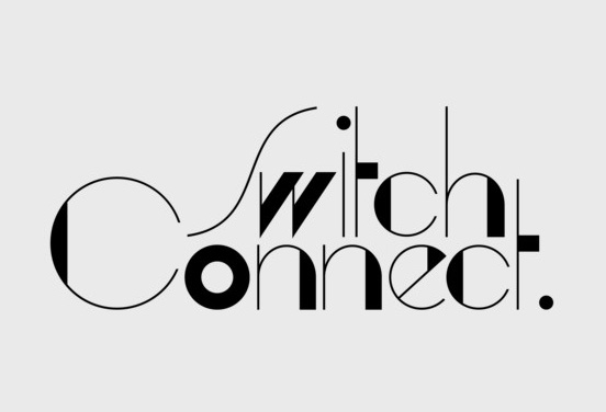
Back in the day, when paper was the king, a lot could be deduced about you from your handwriting. Handwriting is very personal, as if you are thinking through your fingers. In the modern day and age, with the advent of digital, the same can be said about typeface or font family you use to write your resume, or the content for your website. Typography is both a timeless art and a contemporary skill that you have to master in order to choose the right typeface.
Context and Content
Where is your text going to appear? Are you writing an ad copy and you need the typeface to simply pop up? Maybe you are designing a magazine page which has to be pleasing to the eye? If, for instance, you are designing the front cover of a book about the American civil war, using archaic-looking typeface, like Clarendon, might be a good idea.
Legibility
Legibility is “the ease with which a reader can recognize individual characters in text”. You might also call it readability. Your text needs to communicate the message properly while taking into account the limitations of the human eye. Readability is essential. Some typefaces are legible in a large size, but not on a small scale. Therefore, the larger the typeface will be, the more options you have. Artsy typefaces with lots of flair are tough to distinguish when small, for example, but fabulous when big and bold.
Combine Different Typefaces Effectively
This one can be a bit tricky. The general rule is to combine a neutral Serif with a San Serif (e.g. Times New Roman with Helvetica). If you want to be sure that you got this right, you can combine two fonts from the same typeface family like Gill Sans with Perpetua. There are situations when you have to go with your gut instinct and when the design decisions you make should be subjective. As someone once said: “The moment you fully understand a design rule is the moment when you have permission to break it.” For creating a good and effective typography sometimes you must break the rules.
Experienced web designers keep a list of their favourite typefaces where they can quickly review it to find one that suits the need of the moment. Categorise them, if you’ve got several that are similar, using terms such as traditional, modern, fun, urban, youthful, authoritative, business-like and dramatic.
Studies show that sans serif typefaces are harder to read, so use them sparingly and, perhaps, where the typeface is large.


