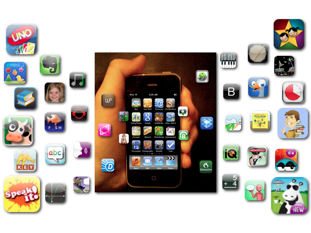
One of the best ways of disseminating information is Mobile apps. However, the technical jargons associated with the apps make it difficult to understand the detail, complexity and cost overruns. Here are seven things that can go a long way in helping to design mobile apps.
Coding without a Plan:
This is an important step while starting for Mobile application design from scratch. This is because without having a plan, there are every possibilities of the app being haphazard and expensive. To begin with, start using a storyboard or a flow chart system with the entire application being drawn on paper along with diagrams. Once complete, you can be sure of building the app. All that is needed now is to write the code of the program.

Not Considering the Screen Size:
This is a very important step. As the size of the screen varies with each mobile device, it becomes necessary to consider it when making your layouts, scaling and display issues. It is not a good idea to put a lot in the interface. There are many reasons to it. The user could get confused seeing so many buttons or the loading process could be a lengthy one. Instead, it is better to design a core system along with the facilities of adding plug-ins at a later time. By doing this way, the design process becomes easier and provide for scalability and ongoing profit streams after the fact.
Not Using Templates:
Using templates and code snippets while building app is a good idea. This saves time and reduces costs.
Using Text in the Icons:
It is better not to use text in the icons. Instead, concentrate on icon design. The icons should display smooth transitions and well-defined edges. Surely, the icons should be obvious from the background and merge into it.
Not Informing the User during Program Loading:
There are many apps that take time to load. If the user does not know about it, then after sometime he or she thinks either the app has stopped working and restarts it, or quit the app and in extreme cases, goes for uninstalling the app completely. Hence, it is important for the user to know when loading of sections of app are happening.
Not Paying Attention to the Different Operating Systems:
It is important for the interface design to match with the layout of the OS. This is to help out building of apps, as with different operating system, there is the need for the apps to be designed accordingly. Hence an iphone interface will be different from that of an Android. One should see that the design of the interface is similar to the layout of the OS. If it is not the case, there is the possibility of confusing or annoying the users and will affect the adoption of app. Along with this, the color of the interface need to be considered as well so that it fits in the environment.
Not Testing the Interface before Deploying:
It is very important to test the interface before deploying it. The entire process could fail if an important part of the procedure is missed out. The testing of the app should be done with people who have not seen the product. This is the critical step. You come to know whether your app is easy with your target audience or something is missing with the app. Once the feedback is received, you are in a better position to judge whether everything is okay or some redesigning is required.
When starting the design process of an app, one needs to know the end result first. The users of the app should be involved in the responsive website design process for making sure that the design is going in the right process.
