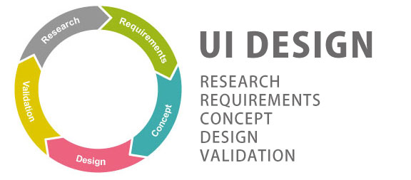
Web design isn’t just about creating websites that look great – although obviously that’s important. Many designers forget about the user experience, yet that should always be the primary focus for every website. User interface design is all about creating a site that is relevant and functional for the viewer, so read on to find out the four top trends coming to a screen or device near you this year.

1. Scroll on
Until fairly recently, the advice to web designers was to keep as much information as possible ‘above the fold’. In simple terms, this means limiting the amount of scrolling that the user has to do, as the commonly held belief was that users dislike having to scroll down. There’s been complete turnaround recently, as studies show that website users much prefer to scroll down a page rather than click on to another page on a site.
2. Moving pictures
Beautiful images and eye-catching graphics will never lose their appeal, but in the coming months you can expect to see a huge increase in the use of video and moving images. And we’re not talking small video boxes either – there’s going to be a big surge in the use of full-screen moving imagery which is designed to grab the viewer’s attention and draw them in to the website’s core message.
Through imaginative use of full-screen video and large-scale imagery, the user is presented with a story, which encourages them to engage more fully with your brand. As an additional bonus, a beautiful or interesting video ends up being shared numerous times across social media platforms, bringing your website to a wider audience.
3. Going Off-Grid
The grid is one of the most basic design elements, long favoured by graphic designers and adopted as a mainstream form of creating websites for years. Suddenly, we are seeing a surge of new web designers who are forsaking traditional design methods and introducing new and experimental websites.
Most users won’t necessarily understand that the design rules are being toyed with, but they most certainly will appreciate that ‘off-grid’ web design offers something new and fresh.
4. Hand-Drawn Illustrations
The internet can be a bland and faceless place, but the use of line drawings and illustrations can bring a touch of individuality to a website. Stick figures and hand-drawn diagrams add a real touch of authenticity to a website and make it seem more friendly to the user. They can add humour, explain concepts and get a message across in a helpful and easy-to-understand manner.
Line drawings show that a human has been involved in the site and reinforce to the user that there is a real person at work behind the computer screen, which helps to foster a sense of belonging and even loyalty to a brand.
These are just a few of the web design trends you can expect to see in the coming months with a clear focus on improving the end-user experience.


